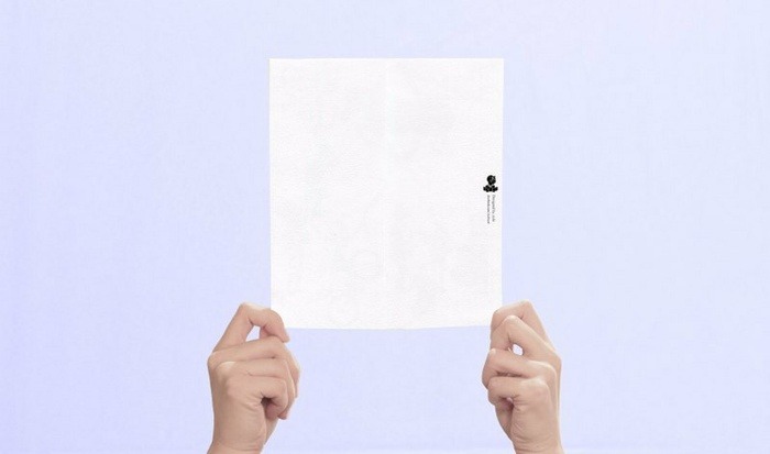
What is the most difficult product to photograph for you?
Stationery is one of the most popular items on Pinkoi, especially artworks prints, postcards, stationery sets, bookmarks and stickers. We’re sure artists and designers like you like to collect them for paper therapy even more!
However, these paper-thin beauties are one of the most challenging to present online: They are 3-dimensional objects, but they appear flat in photographs. Taking their photos starts simple: you place the print on a table, but then you notice it’s too straight on the edges that the photograph looks too flat. Since prints can’t be blamed for being flat, it takes a trick or two to position them well enough as if they’re standing up, like photographing a paper doll hoping it’ll look like a Barbie doll.

A flat image of your artwork isn’t enough to engage potential customers, so we wrote this post to help you convey the touch and feel of your print works so they’ll look their best on Pinkoi.
Tips to consider as a Seller
1. Your product photo is everything
We can’t emphasize this enough. Product photos are the only closest things to the “real product” that customers will see and decide to purchase (or not).
2. Provide different images of your print
We suggest you provide at least a scanned version plus a photo of your print work. This way, customers know what they’re getting, from the paper texture to artwork details, which could be a lot harder to explain by text. In addition, consider posting some character and concept sketches because revealing the process brings your product alive!
Tips to consider for photography
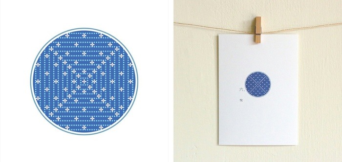
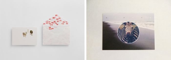
1. Have a clean, white background
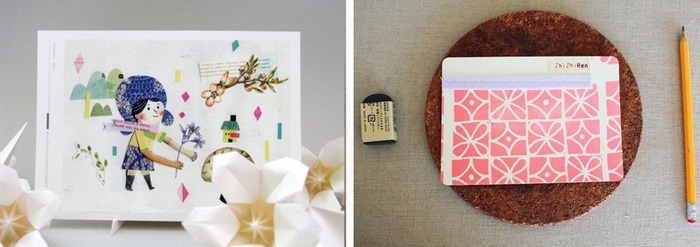
A white table or wall is the best place to start photographing: try symmetrical shots and unbalanced shots, lay the print down or affix it with washi tapes. You can shoot from different angles of single items (remember to take both the front and the back sides) as well as with a whole set. This approach is practical because it doesn’t require a lot of styling if you haven’t spend time on it yet. Just remember, light source and color make all the difference when shooting in white backgrounds.

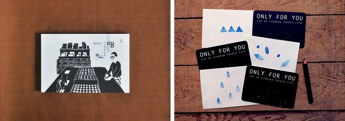
2. Frame it
When it’s framed, a print automatically looks like a product. Besides adding weight and importance, frames conveys your taste: people start imagining how they would frame it and place it themselves, and more often than not, can be similar to what’s shown on your photo.

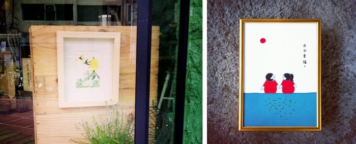

3. Use wooden texture
A flat wooden surface is a great alternative to white background whether you are bored with white, are limited by bad lighting, or have a product that’s already too white. Wood adds textural quality to the image but as long as it’s plain, does not steal the spotlight. Try standing or laying down the print, and avoid light reflection by adjusting angles.


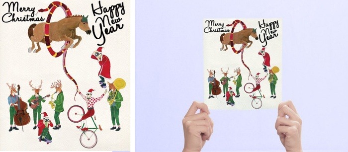
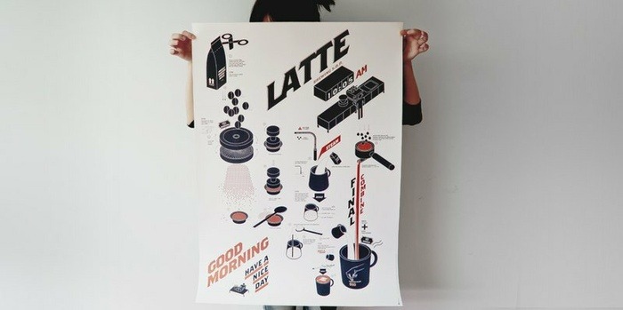
4. Hold it
Literally—hold your product in your hand. This works particularly well for small prints like postcards, cards and bookmarks, because they no longer fall flat, their size is predictable, and this hand gesture simply make the products look accessible.

We’re sure you have seen this style around: Holding a poster against yourself, covering your face and body. It’s a fun way to illustrate the size and spark people’s imagination.

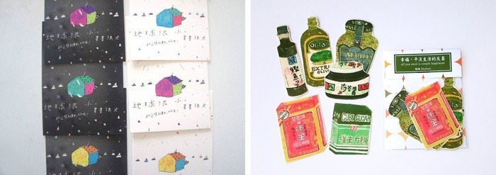
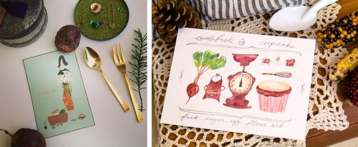
5. Style it with your other products
Create a consistent visual style by using a variety of your own products to style your photos. Because you designed them all, you can put together a stronger brand image. Try using different products to style Product A, or use different colors of Product A to make it stand out. Also, try using related objects to illustrate the scenario of product A.
Since you might have quite a few objects, spend some time arranging them so they look spontaneous and naturally inviting.

Tips we can’t emphasize enough!
1. Check your light source
Light source is the make-or-break of photography. We often see photos that are too blue, green or yellow. How should you avoid it? Read our post about taking great photos even with your phone.
2. Experiment!
You might not be happy with the results right away, but every little step will help you produce great product photos in the long run. Continue to browse and study design blogs, and we’ll soon share a post on how to be selected for Editor’s Pick (based on your photos)!
3. Keep going for it!
If you experiment enough, a certain style will emerge. Observe your sales trend and follower reactions as you test it out, and fine tune until you find what you want. Don’t expect to get it right in the beginning; the only way to discover your style is to try many!
We hope you found these tips helpful, whether for product photos or everyday shots!
► ► ► How to do a Creative Themed Photo Shoot for Your Products
► ► ► Lighting Magic: How to Style Your Photos with Lighting
► ► ► 7 Keys to Telling a Compelling Story with Product Photos
