Before we get into the magic tricks, here’s a bit on why we wrote this article for you.
We believe that getting featured on Pinkoi is a means to an end—our real goal is to help all the designers on Pinkoi establish a high quality storefront that will attract the right customers.
If you are a shopper on Pinkoi, this article will show you the behind-the-scene efforts that the designers pour hours of hard work into. You’ll gain pointers on taking photos, understand how your favorite product photos come to be, and appreciate more good photography in the future!
Product photos are the make-or-break of online visibility.
If you want to do online selling right, product photography should be your priority. When shoppers have no way of touching or feeling your products, browsing your photos is the only shopping experience they have.
For this purpose, photo quality is more important than style. A blurry photo is sure to confuse shoppers, and an image jam-packed with information will lose attention quickly. If you have not established a brand style through photography, don’t worry about it just yet! (But you can read our photos styling tips in this post.) Let’s first dive into the essential guidelines for good quality product photos.
We scour the site everyday to promote brilliant designs, and from experience, the product photo quality is one of the main reasons products are promoted. We’re definitely not judging designs by their cover photos, but seeing good products lose a potential promotional opportunity really goes against our wishes. That’s why we’re providing 8 basic guidelines to photos in regards to 1. Tools and setup and 2. Photography tips.
1. Tools and setup
a) Sufficient lighting
Remember, there is no good photography without good lighting! Image sharpness and correct colors exist because of good lighting. Even if dimmed lighting is part of your style, you’ll still need complementing light source to correctly communicate your product’s colors. Many customers return their orders due to color misunderstandings, which really could have been avoided in the first place! Also, you can still do lighting right even if you’re taking photos with your smartphone. For specific pointers, read our 3 Tips for Great Photos with your Phone.
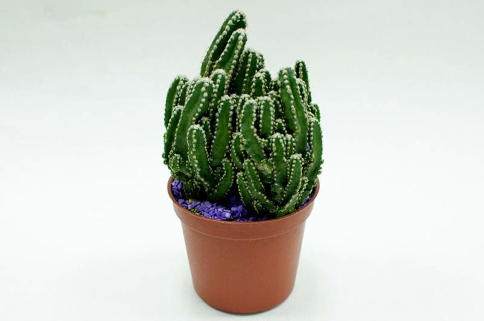
Under sufficient natural light or artificial light, product details will really stand out!
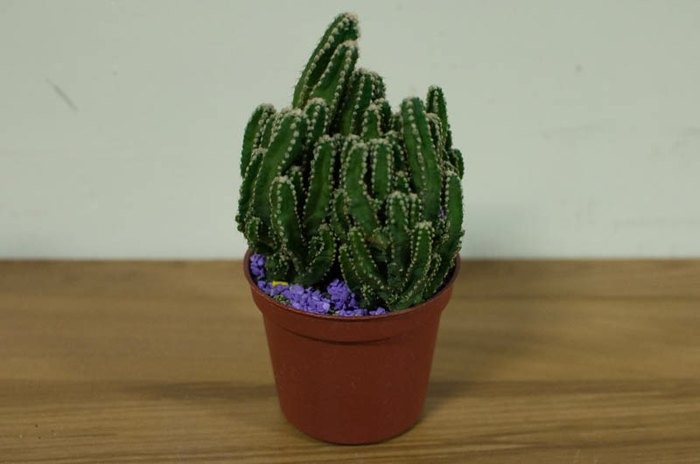
Compared to its first shot, this cactus in insufficient lighting looks abandoned!
b) Steady, steady
Whether you use a smartphone or DSLR, set it on a tripod or have a tripod alternative. Keeping your camera steady is crucial to sharp photo qualities. Lean on the wall or prop your camera on some books if you have to!
c) Close-up modes
When capturing details like beads and embroidery or even small accessories like bracelets, it’s easy to lean in towards the product, ending up with a close-up but very blurry shot. Well, our goal is taking close-ups that are also sharp and detailed, so your potential customers would click on them! Make good use of your camera’s close-up mode (or macro mode.) Since the optimum focus distance is different for every camera, you might need to spend some time finding out what works best. Trust us, getting to know your camera’s capabilities is worth it: your customers could immediately tell the difference!
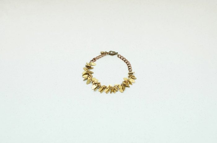
Oh look, a product. What is it? If only we could zoom in on that……
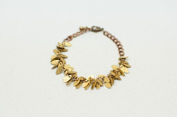
It’s a beautiful bracelet! The close-up mode does it justice!
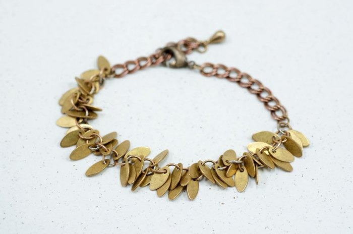
Using a macro lens, the bracelet appears even more defined.
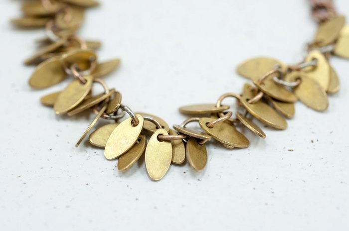
We can almost experience the touch and feel of those brass leaves under the lenses!
d) Correct image size
Setting to a larger image size on your camera gives you better material to work with later on, such as cropping or zooming out for higher resolution.
The size of product photos affects your chances of getting featured too! The requirement for product photos is a 800px width and a 72 dpi resolution. If your image is less than 500 pixels wide, gray borders will appear on the sides and it shows in the thumbnail, too. Avoid using portrait photos as cover images because they might be cropped, making it hard for people to see what your product is.
When doing online promotions, we often choose products that already have good photos. So if photos look incomplete or are low in resolution, we would always sadly give up those products.
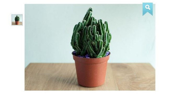
Good example: an 800-pixel wide image.
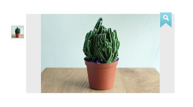
Bad example: a 400-pixel wide image resulting in gray borders.

Left: the thumbnail of a portrait photo, resulting in a crop. Right: the thumbnail of a landscape photo, with the product fully shown.
2. Product Photography tips
a) Have a clean background
You’ll find most of the featured products have one thing in common: a clean background! Not only does a clean background allow your product to stand out, it also makes shoppers feel pleasantly at ease, which is the atmosphere we want to create on Pinkoi. Therefore, simple photos with a focus on product quality have the best chance of being featured on the homepage or in campaigns. After all, the purpose of promotion is to make good designs seen. Quality is the way to go to stand out from all the wonderful products from thousands of Pinkoi sellers!
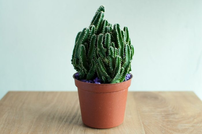
Good example: simple and focused.
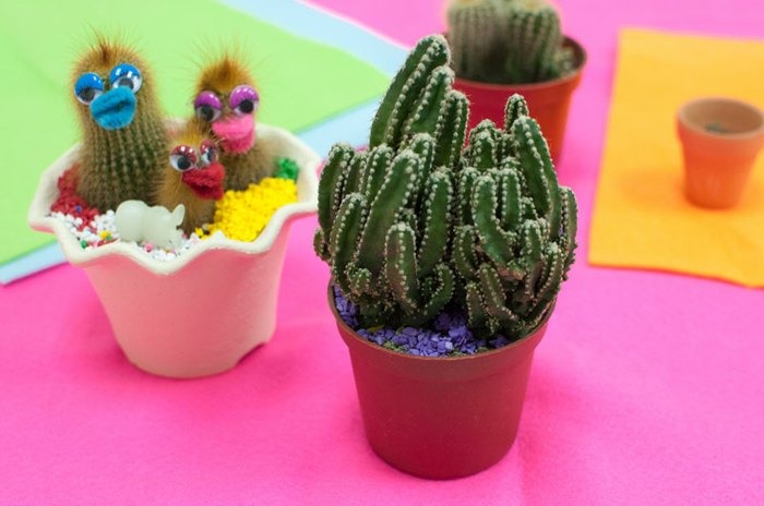
Bad example: which is the product, the cactus or the chicks?
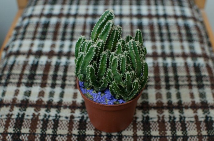
Bad example: the distracting background makes the product look much less promising.
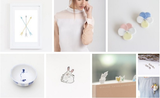
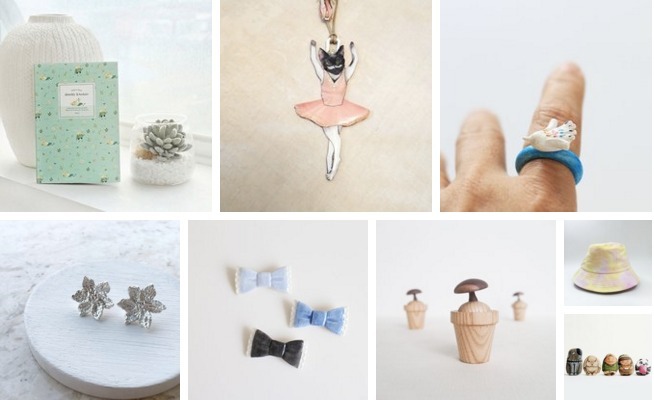
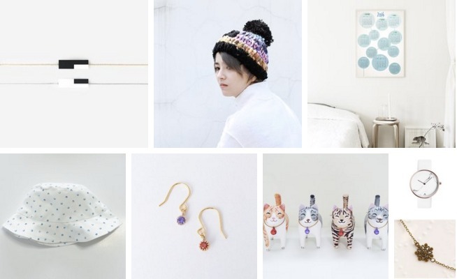
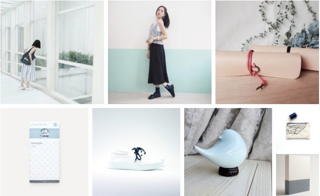
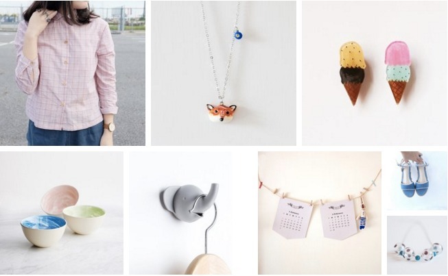
Below, we’ve listed more good examples that have made it to the Pinkoi homepage. If you’re not content with plain old white backgrounds, start styling with our post on How to Prep and Style your Product Photos.
b) Keep away from badges, watermarks and graphics
We understand that sometimes designers want to protect their creations with watermarks or add a special touch with text and graphics. However, they often turn out to be distracting and inconsistent, hence the products couldn’t be promoted unless we take the time to delete those graphics. Instead of risking your chance of being promoted, consider our suggestions: Make good use of the Product Description area instead of putting text on photos. As for copyright, save and manage your original photo files well so you’ll be prepared for any disputes.
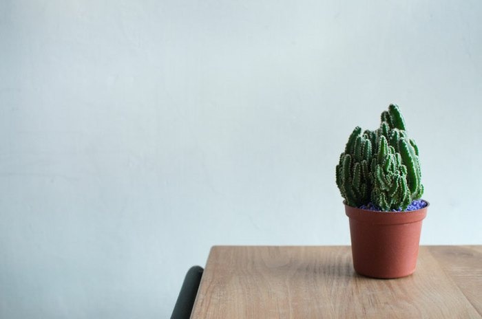
Good example: clean, free of badges, logos, frames or text graphics.
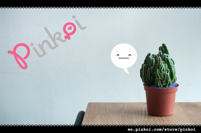
Bad example: photo overrun with a watermark, border graphics, URL, and unnecessary graphics.

Bad example: image with a watermark, lots of texts, duplicate photos, and a distracting background. The price and descriptions don’t need to be here, and the overall resolution is not ideal.
c) Provide multiple shots of the product
Remember how we talked about photos being the only window-shopping experience for online customers? In this case, it’s understandable they probably wouldn’t buy the product based on just one look, right? We all want to experience products in many different ways, being able to look at it from the front, from the back, from a distance or close up on details and special features. Also, people usually like to see products in action in a perfect world, so providing photos in various angles and scenarios could do wonders. For every product, you can upload up to 5 photos, so don’t be shy and show the best of your products. More photos also mean more flexibility when we consider you for promotions.

See the 5 thumbnails on the left for 5 different photos?
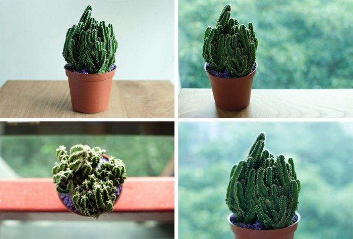
Examples of different photos of the cactus.
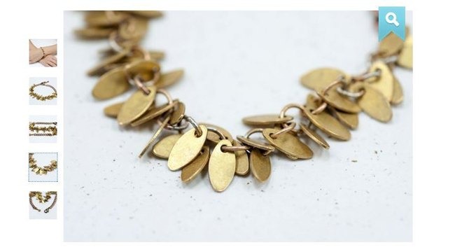
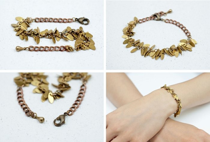
Examples of different photos of the bracelet.
d) Shoot with models
Showing products worn by models is very helpful in terms of both style and inviting potential sales. Customers can easily understand the size of a product when it’s worn by a model. Also, it inspires them to start imagining how they would wear the product themselves. On the other hand, the choice of model is relatively important for your brand. What would your brand look like if it were a person? Think not just traditional fashion models, but also hand models and feet models, etc.

By the look of it, we assume this bracelet might be kids’ size?
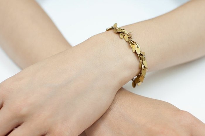
It’s actually bigger than we thought!
Well, what do you think?
We are impressed by the efforts of designers on Pinkoi! Since every detail matters, they put in a lot of work to make everything come together and offer the best experience for their customers.
We hope this post helps clarify the expectations for product photos on Pinkoi, so you can open a shop smoothly and boost sales! If you already own a Pinkoi shop, give it a health checkup to increase your chance of being promoted. Perhaps we’ll see you on tomorrow’s homepage!
